What Are the Aesthetics of a Better Future?
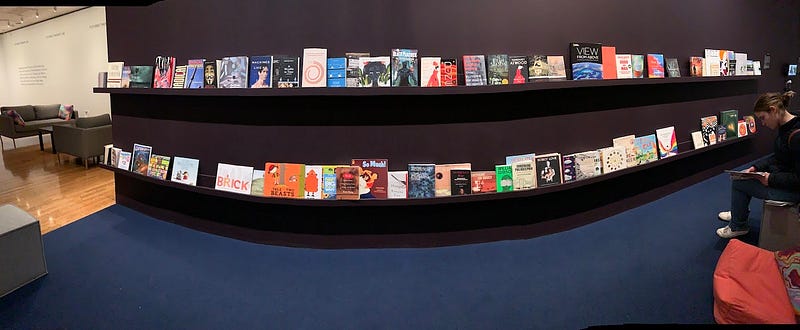
I am sitting on a triangular bean bag in a space labelled “Futures Therapy Lab.” The walls are lined with books sporting titles such as Robot Love, Feminist Queer Crip, The Sausage of the Future, and of course, Future Shock. At tables, kids are coloring, urged by docents to rethink everyday objects. The exercises change periodically — a few weeks ago, they were cutting phrases and pictures out of pulp sci-fi books to remix them into new narratives.
 Decompressing in the Futures
Therapy Lab (Photo by Jessica Clark)
Decompressing in the Futures
Therapy Lab (Photo by Jessica Clark)The lab is set at the exit of the in the Philadelphia Museum of Art’s current exhibit, Designs for Different Futures, as a sort of decompression chamber, offering a space for “reflection, discussion, and art-making.” It’s a welcome intervention. This is my fourth time through the exhibit, and I’m still not sure what to think. Some pieces move me, some repel. Others are just…meh. My husband’s offhand review: “It feels like a science fair.”
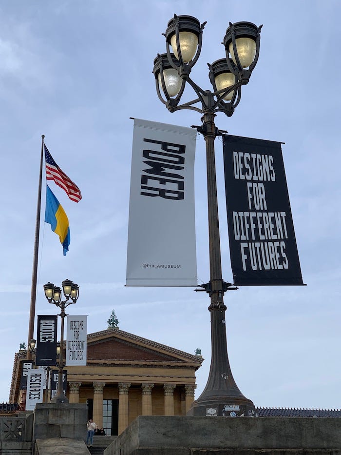
 Branding
for the exhibition outside of the museum (Photo by Jessica Clark)
Branding
for the exhibition outside of the museum (Photo by Jessica Clark)Don’t get me wrong: I’m totally down with these curators’ methods and goals. I get it all — the need to acknowledge multiple futures rather than a single totalizing one, the recontextualizing of “design” to include a broad array of speculative and experimental objects and processes, the allure of sci-fi and maker cultures, the focus on issues rather than methods, materials, or masters. There are artists we’ve featured in Immerse on the walls, and books I’ve cherished on the shelves. I am glad the show is here in my hometown, and will continue to drive dialogue as it travels on to the Walker Art Center and the Art Institute of Chicago.
But still — yuck. The jagged font that is the signature visual element of the show is dissonant and oddly retro, recalling a ’90s issue of Wired. A glass room featuring the simulated smells of extinct flowers is supposed to be poignant I think, but instead just feels mildly claustrophobic. Some of the objects just fall flat: The gimmicks of a science museum lose interest in the context of an art museum.
Part of the issue here is that pieces that reflect on dystopia just often aren’t aesthetically pleasing, exactly by design. The counterpoint: appealing objects and narratives on such topics can also spark a feeling of unease.
 Driver Less Vision takes visitors
into the musings of a car still roaming after humans have disappeared (Photo by Jessica
Clark)
Driver Less Vision takes visitors
into the musings of a car still roaming after humans have disappeared (Photo by Jessica
Clark)For example, I return several times to experience Driver Less Vision, an installation projected on a dome under which visitors crane their necks to watch glitchy images captured from a future in which lonely driverless cars wander through a postapocalyptic Seoul, South Korea. In the absence of its master, the car, which is narrating, muses, “It’s been a bit off since the event…you were gone and we continued to go.” The piece concludes with poetic lines about an Earth without humans, and it gets me every time.
Driver Less Vision is visually intriguing but not a slick or comfortable experience. Its dome looks naked, unfinished, and the combination of images from the car’s LiDAR scanner and 360 footage is choppy and designed to unnerve. From the exhibition catalogue: “This technique precisely emphasizes dissonant perceptions, illustrating how the machine’s intelligence corresponds less and less to a human understanding of the world.”
In contrast, In Plain Sight is beautifully produced and hypnotic. A wall-scale video viewed in a darkened room, it leads viewers through a complex series of data visualizations based on satellite data, which capture different levels of electrical light visible from the sky at night. By comparing regions of dark vs. light, the piece explores global commerce, privilege, and inequity. The message is equally uncomfortable, but the experience is oddly compelling.
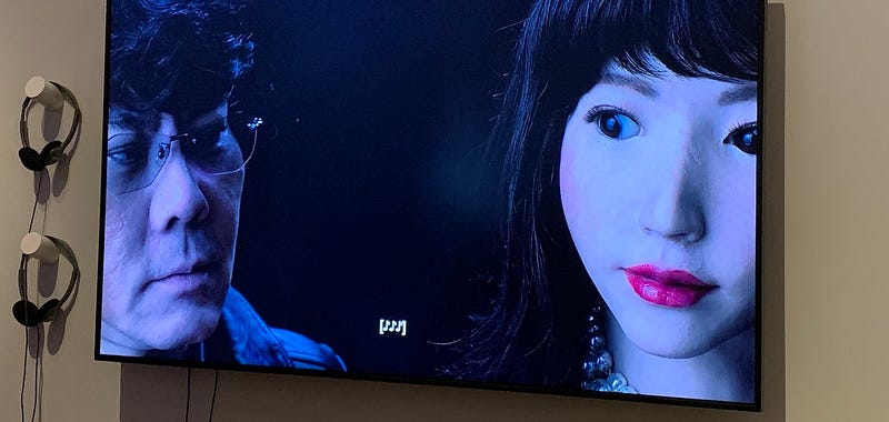
 The Performers captures uncanny
interactions between androids, their models, and their maker (Photo by Jessica Clark)
The Performers by filmmaker Barbara Anastacio confronts the discomfort head-on. It depicts the work of professor Hiroshi Ishiguro, whose aim is to make “the world’s first fully autonomous, sentient android.” His creations include the eerie Erika, pictured above, as well as a replica of himself.
In the gallery, this piece was juxtaposed with a large projection of a hologram of a woman from the film Blade Runner 2049. Here, this figure is used to interrogate our queasy relationship to simulated humans. In the film, this towering naked character’s role is less clear. Is it a critique of the objectification of women, the projected creation of virtual, interactive sex dolls? Or is it just another gratuitous piece of offhand fetishization?
This brings into relief another challenge faced by artists and media-makers seeking to craft alternate visions of the future: They often do so in conversation with now-ubiquitous commercial narratives about the topic: Black Mirror, The Matrix, Minority Report. On the one hand, this means they can fall short of such high production values, looking didactic, amateurish in comparison. On the other hand, they end up borrowing too much from popular tropes (The future is silver! Translucent! Urban! Filled with black leather!) to an extent that they do not feel original. All too often, the futures on offer are disappointing: corporate and shiny, hard-edged and nasty, chilly and chilling.
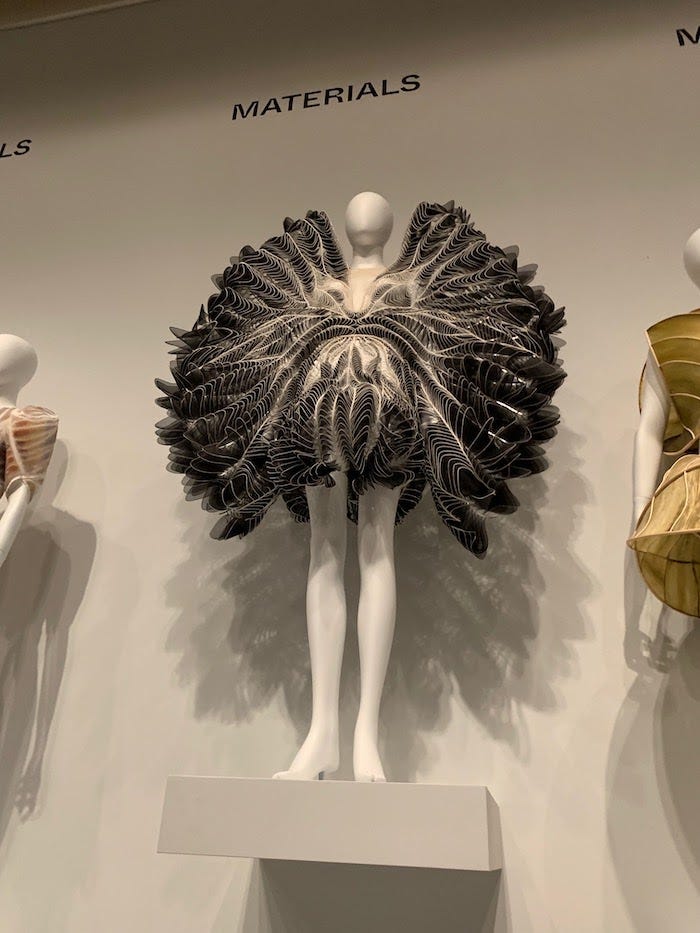
 The Synopia Finale Dress is based
on the sound waves of birds in flight (Photo by Jessica Clark)
The Synopia Finale Dress is based
on the sound waves of birds in flight (Photo by Jessica Clark)A few of the pieces in this show do manage to break from these confines to present something fresh. For example, the Synopia Finale Dress, designed by Iris van Herpen, is based on sound waves of birds in flight. It’s both pleasing to look at and conceptually elegant, meshing cutting-edge media and materials.
Perhaps what I am seeking — an aesthetic not just for different futures but a better one — has not cohered. Previous social justice movements had the benefits of hand-crafted or DIY aesthetics to set them apart: Hand-lettered protest signs, the cut-up punk aesthetic, trippy hippy-dippy illustrations. Not always gorgeous, mind you, but distinctive. But now, independent makers are often working with the same tools as corporations — rendering everything similar.
Perhaps what this palpably dystopian moment demands is a different conception of beauty — one that’s less based on pleasing surfaces or structural symmetry, more on the identities and intentions of the makers. Sasha Costanza-Chock documents some of these efforts to shift the frame in her new book, Design Justice: Community-Led Practices to Build the Worlds We Need. In January, we published a trio of articles about the Guild of Future Architects, founded by Sharon Chang. In an essay for the online journal Adjacent, Chang calls for a “more beautiful future,” which would be collectively developed, “socially democratic, culturally diverse and economically equitable.” Beauty here then, is contrasted with the hideousness of tyranny and prejudice.
But in the end, perhaps what critics like me are seeking doesn’t really matter so much. There are numerous possible futures — and letting go of controlling or predicting “the future” can provide space for aesthetics yet to be realized. In the catalogue, a conversation between the exhibition curators ends with this thought: “[W]e are talking about futures plural — multiple, contingent, socially located, and yet to be formed. Onward.”
Interface Everywhere is a column written by Immerse editor Jessica Clark, which explores the implications of storytelling at the cusp of the physical and the digital.
Immerse is an initiative of the MIT Open DocLab and The Fledgling Fund, and it receives funding from Just Films | Ford Foundation and the MacArthur Foundation. IFP is our fiscal sponsor. Learn more here. We are committed to exploring and showcasing media projects that push the boundaries of media and tackle issues of social justice — and rely on friends like you to sustain ourselves and grow. Join us by making a gift today.