 Decoding Possibilities
(2017) by Ron Romi Morrison and Treva Ellison, is an artistic examination of redlining’s effects in
the landscape as well as a celebration of creative resistance to redlining. Contemporary maps of
Boston are combined with historic redlining maps, as well as maps created from the Combahee River
Collective’s writings. Courtesy of Ron Romi Morrison and Treva Ellison.
Decoding Possibilities
(2017) by Ron Romi Morrison and Treva Ellison, is an artistic examination of redlining’s effects in
the landscape as well as a celebration of creative resistance to redlining. Contemporary maps of
Boston are combined with historic redlining maps, as well as maps created from the Combahee River
Collective’s writings. Courtesy of Ron Romi Morrison and Treva Ellison.This article was adapted from Data Feminism, a book by researchers Catherine D’Ignazio and Lauren F. Klein that explores “a way of thinking about data and its communication that is informed by intersectional feminist thought and action.”
In 2012, twenty kindergarten children and six adults were shot and killed at an elementary school in Sandy Hook, CT. In the wake of this tragedy, and the weight of others like it, the design firm Periscopic started a new project — to visualize gun deaths in the United States. While there is no shortage of prior work in the form of bar charts or line graphs of deaths per year, Periscopic, a company whose tagline is “do good with data,” took a different approach.
When you load the webpage, you see a single, arcing line that reaches out over time. Then, the color abruptly shifts from orange to white. A small dot drops down, and you see the phrase, “Alexander Lipkins, killed at 29.” The arc continues to stretch across the screen, coming to rest on the x-axis, where you see a second phrase, “could have lived to be 93.” Then, a second arc appears, displaying another arcing life. The animation speeds up over time, and the arcing lines increase, along with a counter that displays how many years of life have been “stolen” from these gun victims. After a couple of (long) minutes, the visualization moves through all of the year 2013, arriving at 11,419 people killed and 502,025 stolen years.
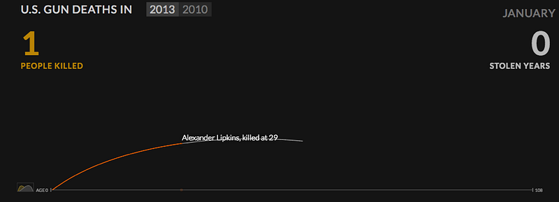
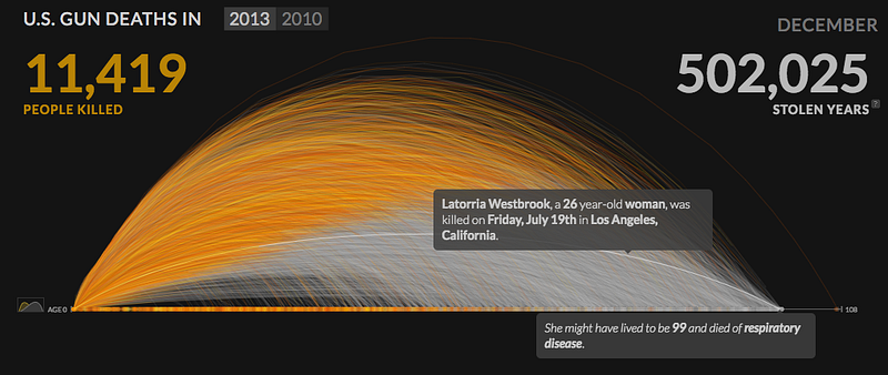 An animated visualization of the
“stolen years” of people killed by guns in the United States in
2013. The first image (a) shows the beginning state of the animation and the second image (b)
shows the end state. Images by Periscopic.
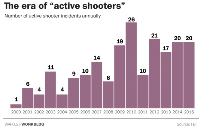 A bar chart of the number of
“active shooter” incidents in the United States between 2000 and
2015. Images by Christopher Ingraham for the Washington Post.
A bar chart of the number of
“active shooter” incidents in the United States between 2000 and
2015. Images by Christopher Ingraham for the Washington Post.What is different about Periscopic’s visualization than a more conventional bar chart of similar information such as “The era of ‘active shooters’” from the Washington Post?
The Post’s graphic has a proposition — that active shooter incidents are on the rise — and demonstrates visual evidence to that effect. But Periscopic’s work is framed around a singular emotion: loss. People are dying, their remaining time on earth has been stolen from them. These people have names and ages. We presume they have parents and partners and children who also suffer from that loss. The data scientists who worked on the project used rigorous statistical methods and demographic information in order to infer how long that person would have lived, which are documented in their notes. But in spite of the statistical rigor, and its undeniable emotional impact, “U.S. Gun Deaths” drew mixed responses from the visualization community. We couldn’t decide: Should a visualization evoke emotion?
The received wisdom in technical communication circles is, emphatically, “NO.” In the recent book, A Unified Theory of Information Design, the authors state: “The plain style normally recommended for technical visuals is directed toward a deliberately neutral emotional field, a blank page in effect, upon which viewers are more free to choose their own response to the information.” Here, plainness is equated with the absence of design, and thus greater freedom on the part of the viewer to interpret the results for themselves. Things like colors and icons, it is implied, work only to stir up emotions and cloud the viewer’s rational mind.
In fact, in the field of data visualization, any kind of ornament has historically been viewed as suspect. Why? Well, as historian of science Theodore Porter puts it, “quantification is a technology of distance” and distance was historically imagined to serve objectivity by producing knowledge independently of the people that make it. This echoes nineteenth-century statistician Karl Pearson’s exhortation for people to set aside their own feelings and emotions when it came to statistics. The more seemingly neutral, the more rational, the more true, the better.
Data visualization, “the unempathetic art”
At a data visualization master class in 2013, workshop leaders from the Guardian newspaper called spreadsheet data — those endless columns and rows — “clarity without persuasion.”
Back in the olden days of visualization, before the rise of the web elevated the visual display of data into a prized (and increasingly pervasive) artform, Edward Tufte, statistician, and statistical graphics expert, invented a metric for measuring the superfluous information included in a chart– what he called the “data-ink” ratio. In his view, a visualization designer should strive to use ink only to display the data. Any ink devoted to something other than the data itself — such as background color, iconography, or embellishment — should be immediately erased and, he all but says, the designer spat upon.
Visual minimalism, according to this logic, appeals to reason first. (“Just the facts, ma’am,” says Joe Friday to every female character on Dragnet). Decorative elements, on the other hand, are associated with messy feelings — or, worse, represent stealthy (and, of course, unscientific) attempts at emotional persuasion. Data visualization has even been classified as the “unempathetic” art, in the words of designer Mushon Zer-Aviv, because of its emphatic rejection of emotion.
The belief that women are more emotional than men (and that men are more reasoned than women) is one of the most persistent stereotypes in the world today. Indeed, psychologists have called it the “master stereotype,” and puzzled over how it endures even when certain emotions– even extreme ones, like anger and pride– are simultaneously coded as male.
But what happens if we let go of the binary logic for a minute and posit two questions to challenge this master stereotype. First, is visual minimalism really more neutral? And second, how might activating emotion — leveraging it, rather than resisting emotion in data visualization — help us learn, remember, and communicate with data?
Crafting data stories from a standpoint
Information visualization has diverse historical roots. In its most recent, web-based incarnation, many of data visualization’s theorists and practitioners have come from technical disciplines aligned with engineering and computer science, and have not been trained in the most fundamental of all Western communication theories: rhetoric.
In the ancient Greek treatise of the same name, Aristotle defines rhetoric as “the faculty of observing in any given case the available means of persuasion.” Rhetoric does not (only) consist of political speeches made by men in robes on ancient stages. Any communicating object that makes choices about the selection and representation of reality is a rhetorical object. Whether or not it is rhetorical (it always is) has nothing to do with whether or not it is “true” (it may or may not be).
Why does the question of rhetoric matter? Well, because “a rhetorical dimension is present in every design,” as Jessica Hullman, a researcher at the University of Washington, says of data visualization. This includes visualizations that do not deliberately intend to persuade people of a certain message. We would say that it especially and definitively includes those so-called “neutral” visualizations that do not appear to have an editorial hand. In fact, those might even be the most perniciously persuasive visualizations of all!
Editorial choices become most apparent when compared with alternative choices. For example, in his book The Curious Journalist’s Guide to Data, journalist Jonathan Stray discusses a data story from the New York Times about the September 2012 jobs report. The Times created two graphics from the report — one framed from the perspective of Democrats (the party in power at the time) and one framed from the perspective of Republicans.
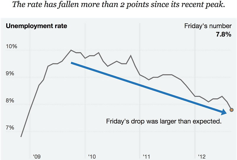 A data visualization of the
September 2012 jobs report from the perspective of Democrats. Image by Mike Bostock, Shan Carter,
Amanda Cox, and Kevin Quealy, for the New York Times, as cited in The
Curious Journalist’s Guide to Data by Jonathan Stray.
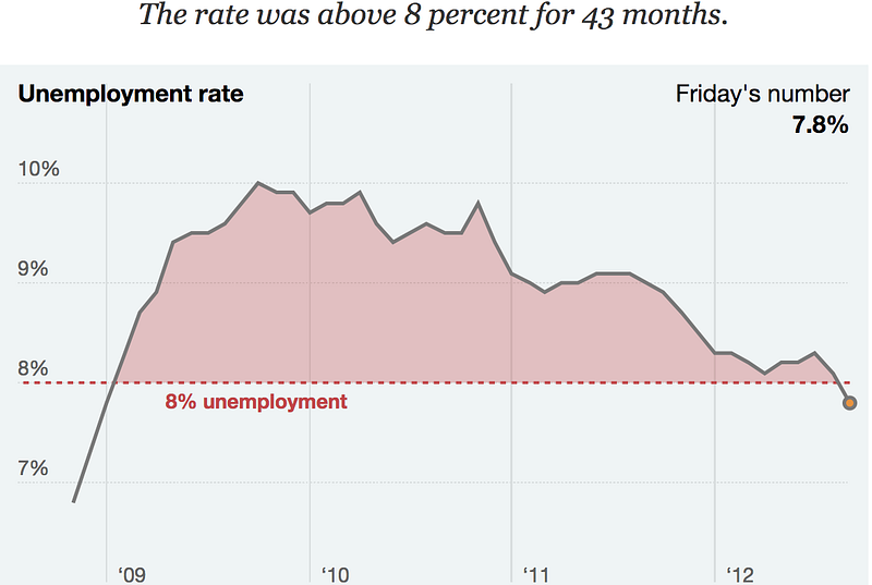 A data visualization of the
September 2012 jobs report from the perspective of Republicans. Image by Mike Bostock, Shan Carter,
Amanda Cox, and Kevin Quealy, for the New York Times, as cited in The
Curious
Journalist’s Guide to Data by Jonathan Stray.
A data visualization of the
September 2012 jobs report from the perspective of Republicans. Image by Mike Bostock, Shan Carter,
Amanda Cox, and Kevin Quealy, for the New York Times, as cited in The
Curious
Journalist’s Guide to Data by Jonathan Stray.Either of these graphics, considered in isolation, appears to be neutral and factual. The data are presented with standard methods (line chart and area chart respectively) and conventional positionings (time on the x-axis, rates expressed as percentages on the y-axis, title placed above the graphic). There is a high data-ink ratio in both cases, and very little in the way of ornamentation. But the graphics have significant editorial differences. The Democrats’ graphic emphasizes that unemployment is decreasing — in its title, the addition of the thick blue arrow pointing downwards, and the annotation “Friday’s drop was larger than expected.” Whereas, the Republicans’ graphic highlights the fact that unemployment has been steadily high for the past three years — through the use of the “8% unemployment” reference line, the choice to use an area chart instead of a line, and, of course, the title of the graphic. So neither graphic is neutral but both graphics are factual. As Jonathan Stray says, “the constraints of truth leave a very wide space for interpretation.” And importantly, in data communication, it is impossible to avoid interpretation (unless you simply republish the September Jobs Report as your visualization, but then it wouldn’t be a visualization).
Hullman and co-author Nicholas Diakopoulous wrote an influential paper in 2011 introducing concepts of rhetoric to the information visualization community. Their main argument is that visualizing data involves editorial choices — some things are necessarily highlighted, while others are necessarily obscured. When designers make these choices, they carry along with them “framing effects,” which is to say they have an impact on how people interpret the graphics and what they take away from them.
For example, it is standard practice to cite the source of one’s data. This functions on a practical level — so that a reader may go out and download the data themselves. But this choice also functions as what Hullman and Diakopoulous call provenance rhetoric designed to signal the transparency and trustworthiness of the presentation source to end-users. This trust between the designers and their audience, in turn, increases the likelihood that viewers will believe what they see.
So if plain, “unemotional” visualizations are not neutral but are actually extremely persuasive, then what does this mean for the concept of neutrality in general? Scientists and journalists are just some of the people that get nervous and defensive when questions about neutrality and objectivity come up. Auditors and accountants get nervous, too. They often assume that the only alternative to objectivity is a retreat into complete relativism and a world in which everyone gets a medal for having an opinion. But there are other options.
Rather than valorizing the neutrality ideal, and trying to expunge all human traces from a data product because of “bias,” feminist philosophers have offered alternative paths towards truth. Sandra Harding would posit a different kind of objectivity that strives for truth at the same time that it considers — and discloses — the standpoint of the designer. This has come to be called “standpoint theory.” It is defined by what Harding calls “strong objectivity” which acknowledges that regular-grade, vanilla objectivity is mainly made by mostly rich white guys in power and does not include the experiences of women and other minoritized groups.
This myopia inherent in traditional “objectivity” is what provoked renowned cardiologist Dr. Nieca Goldberg to title her book Women Are Not Small Men because she found that heart disease in women unfolds in a fundamentally different way than in men. The vast majority of scientific studies — not just of heart disease, but of most medical conditions — are conducted on male subjects, with women viewed as varying from this “norm” only by their smaller size. Harding and her colleagues would say that the key to fixing this issue is to acknowledge that all science, and indeed all work in the world, is undertaken by individuals, each with a particular standpoint: gender, race, culture, heritage, life experience, and so on.
Rather than viewing these standpoints as threats that might bias our work — for, after all, even the standpoint of a rich white guy in power is a standpoint — we should embrace each of our standpoints as valuable perspectives that can frame our work. Our diverse standpoints can generate creative and wholly new research questions.
Making data visceral
Along with this embrace of our various standpoints goes the rebalancing of the false binary between reason and emotion. Since the early 2000s, there has been an explosion of research about “affect” — the term that academics use to refer to emotions and other subjective feelings– from fields as diverse as neuroscience, geography, and philosophy. This work challenges the thinking, inherited from Descartes, which casts emotion as irrational and illegitimate, even as it undeniably influences all of the social and political processes of our world. Evelyn Fox Keller, a physicist-turned-philosopher, famously employed the Nobel-prize-winning research of geneticist Barbara McClintock, in order to show how even the most profound of scientific discoveries are generated from a combination of experiment and insight, reason and emotion. And sociologist Patricia Hill Collins describes an ideal knowledge situation as one in which “neither ethics nor emotions are subordinated to reason.”
Once we embrace the idea of leveraging emotion in data visualization, we can truly appreciate what sets Periscopic’s Gun Deaths apart from the Washington Post graphic, or any number of other gun death charts that have appeared in newspapers and policy documents.
The Washington Post graphic represents death counts as blue ticks on a generic bar chart. If we didn’t read the caption, we wouldn’t know whether we were counting gun deaths in the U.S., haystacks in Kansas, exports from Malaysia, or any other semi-remote statistics of passing interest. But the Periscopic visualization leads with loss, grief, and mourning. It provides a visual language for representing the years that could have been — numbers that are accurate, but not technically facts. It uses pacing and animation to help us appreciate the scale of one life, and then compounds that scale 11,419-fold. The magnitude of the loss, especially when viewed in aggregate, is a staggering and profound truth — and the visualization helps recognize it as such through our own emotions. Note that emotion and visual minimalism are not incompatible — the Periscopic visualization shows how emotion can be leveraged with visual minimalism for maximal effect.
Skilled data artists and designers know these things already, and are pushing the boundaries for what affective and embodied data visualization could look like. In 2010, Kelly Dobson founded the Data Visceralization research group at the Rhode Island School of Design (RISD) Digital + Media graduate program. The goal for this group was not to visualize data but to visceralize it. Visual things are for the eyes, but visceralizations are data that the whole body can experience– emotionally, as well as physically.
The reasons for visceralizing data have to do with more than simply creative experimentation. How do visually impaired people access charts and dashboards? According to the World Health Organization, 253 million people globally live with some form of visual impairment. In contrast to traditional navigation apps, Aimi Hamraie, director of the Mapping Access project at Vanderbilt University, advocates for apps with multisensory navigation. Hamraie writes, “Rather than relying entirely on visual representations of data, for example, digital-accessibility apps could expand access by incorporating ‘deep mapping,’ or collecting and surfacing information in multiple sensory formats. Such a map would be able to show images of the doorway or integrate turn-by-turn navigation. Deeper digital-accessibility maps can offer both audio and visual descriptions of spatial coordinates, real-time information about maintenance or temporary barriers, street views, and even video recordings.”
Creators in the visceralization mode have crafted haptic data visualizations, data walks, data quilts, musical scores from scientific data, wearable objects that capture your breaths and play them back later, and data performances. These types of objects and events are more likely to be found in the context of galleries and museums and research labs, but there are many lessons to be learned from them for those of us who make visualizations in more everyday settings.
For example, in the project A Sort of Joy (Thousands of Exhausted Things), a theater troupe joined with a data visualization firm to craft a live performance based on metadata about the artworks held by New York’s Museum of Modern Art. With 123,951 works in its collection, MoMA’s metadata consists of the names of artists, the titles of artworks, their media formats, and their time periods. But how does an artwork make it into the museum collection to begin with? Major art museums and their collection policies have long been the focus of feminist critique, starting at least from Linda Nochlin’s canonical 1971 essay, “Why Have There Been No Great Women Artists?” Whose work gets collected in museums and galleries? For our purposes, who is collected translates into who is counted in the annals of history — and, as you might guess, this history has mostly consisted of a parade of white male “masters.”
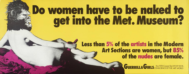 Do Women Have to Be Naked to
Get into the Met. Museum? An infographic (of a sort) created by the Guerrilla Girls in
1989, intended to be displayed on a bus billboard. Courtesy of the Guerrilla Girls.
Do Women Have to Be Naked to
Get into the Met. Museum? An infographic (of a sort) created by the Guerrilla Girls in
1989, intended to be displayed on a bus billboard. Courtesy of the Guerrilla Girls.In 1989, for example, the Guerrilla Girls, an anonymous collective of female artists, published what we would today call an infographic: Do women have to be naked to get into the Met. Museum? The graphic was designed to be displayed on a billboard. However, it was rejected by the sign company because it “wasn’t clear enough.” (If you ask us, it’s pretty clear).
The Guerrilla Girls then paid for it to be printed on posters that were displayed throughout the New York City bus system, until the bus company canceled their contract, stating that the figure “seemed to have more than a fan in her hand.” (It is definitely more than a fan). The figure is certainly provocative, but the poster also makes a data-driven argument by tabulating gender statistics for artists included in the Met collection and comparing them to the gender stats for the subjects of art included in the collection. As per the poster, the Met readily collects paintings in which women are the subjects, but not those in which women are the artists themselves.
A Sort of Joy deploys wholly different tactics to similar ends. The performance starts with a group of white men standing in a circle in the center of the room. They face out towards the audience, which stands around them. The men are dressed like stereotypical museum visitors: collared shirts, slacks, etc. Each wears headphones and holds an iPad on which the names of artists in the collection scroll by.
“John,” the men say together. We see the iPads scrolling through all of the names of artists in the MOMA collection whose first name is John: John Baldessari, John Cage, John Lennon, John Waters, and so on. Three female performers, also wearing headphones and carrying iPads with scrolling names, pace around the circle of men. “Robert,” the men say together, and the names scroll through the Roberts alphabetically. The women are silent and keep walking. “David,” the men say together. It soon becomes apparent that the artists are sorted by first name, and then ordered by which first name has the most works in the collection. Thus, the Johns and Roberts and Davids come first, because they have the most works in the collection. But Marys have fewer works, and Mohameds and Camilas are barely in the register.
Several minutes later, after the men say “Michael”, “James”, “George”, “Jean”, “Hans”, “Thomas”, “Walter”, “Edward”, “Yan”, “Joseph”, “Martin”, “Mark”, “José”, “Louis”, “Frank”, “Otto”, “Max”, “Steven”, “Jack”, “Henry”, “Henri”, “Alfred”, “Alexander”, “Carl”, “Andre”, “Harry”, “Roger” and “Pierre”, “Mary” finally gets her due. It’s spoken by the female performers; the first sound they’ve made.
For audience members, the experience starts as one of slight confusion. Why are there men in a circle? Why do they randomly speak someone’s name? And what are those women walking around so intently? But “Mary” becomes a kind of a-ha moment– the same that researcher Robert Kosara says that data visualization is so good at producing– when the highly gendered nature of the collection is revealed. From that point on, audience members start to listen differently, eagerly awaiting the next female name. It takes more than three minutes for “Mary” to be spoken, and the next female name, “Joan,” doesn’t come for a full minute longer. “Barbara” follows immediately after that, and then the men return to reading, “Werner”, “Tony”, “Marcel”, “Jonathan”.
From a data analysis perspective, “A Sort of Joy” consists of simple operations: only counting and grouping. The results could easily have been represented by a bar chart or a treemap of first names. But rendering the dataset as a time-based experience makes the audience wait and listen. It also runs counter to the mantra in information visualization expressed by Ben Shneiderman in the mid-1990s: “Overview first, zoom and filter, then details-on-demand.”
Instead, in this data performance, we do not see “the whole picture”. We hear and see and experience each data point one at a time. The different gender expressions, body movements, and verbal tones of the performers draw our collective attention to the issue of gender in the MoMA collection. We start to anticipate when the next female name will arise. We feel the gender differential, rather than see it.
This feeling is affect. It comprises the emotions that arise when experiencing the performance and the physiological reactions to the sounds and movements made by the performers, as well as the desires and drives that result — even if that drive is to walk into another room because the performance is disconcerting or just plain long.
Designing data visceralizations requires a much more holistic conception of the viewer. The viewer isn’t just a pair of eyes attached to a brain. They are a whole body– a complex, feeling one. A body located in space, with a history and a future. Visceralization can be found in many current projects, even if the creators don’t always describe their work in those terms. For example:
- Catherine–one of the authors of this book–and artist Andi Sutton led walking tours of the future coastline of Boston based on sea-level rise
- Lauren (the other author) and her team of Georgia Tech students are recreating Elizabeth Palmer Peabody’s large-scale charts from the 19th century using touch sensors and individually addressable LEDs.
- Mikhail Mansion made a leaning, bobbing chair that animatronically shifts based on real-time shifts in river currents.
- Teri Rueb stages “sound encounters” between the geologic layers of a landscape and the human body that is affected by them.
- Artist-researchers Ron Morrison and Treva Ellison obfuscate maps, and viewers have to put on special glasses called Racialized Space Reduction Lenses (RSRL) to see beneath the maps
- Simon Elvins drew a giant paper map of pirate radio stations in London that you can actually listen to.
- Jessica Rajko, Jacqueline Wernimont, and Stjepan Rajko created a hand-crocheted net that vibrates in response to the data “shed” by the cell phones of people walking by.
- Tanya Aguiñigas created an installation of knotted textiles, inspired by the ancient Andean time-keeping technique of quipu, in order to call attention to the hours, days, and months spent by those seeking to cross the U.S.-Mexico border.
- A robot designed by Annina Rust decorates real pies with pie charts about gender equality and then visitors eat them
- This list could go on.
While these projects may seem to be speaking to another part of the brain than your standard histograms or network maps, there is something to be learned from the opportunities opened up by visceralizing data. In fact, scientists are now proving by experiment what designers and artists have long known through practice: activating emotion, leveraging embodiment, and creating novel presentation forms help people learn more from data-driven arguments, and remember them more fully.
Conclusion
The third principle of Data Feminism is to elevate emotion and embodiment. These are crucial, if often undervalued, tools in the data communication toolbox. How did the field of data communication arrive at conventions that prioritize rationality, devalue emotion, and completely ignore the non-seeing organs in the human body? Who is excluded when only vision is included?
Any knowledge community inevitably places certain things at the center and casts others out, in the same way, that male bodies have been taken as the norm in scientific study and female bodies imagined as a deviation from the norm or those abled bodies are the primary design case and disabled bodies are a retro-fit, or that rationality has been valued as an authoritative mode of communication and emotion cast out. But, following feminist theorist Elizabeth Grosz, what is regarded as “excess” in any given system might possibly be the most valuable thing to explore because it tells us the most about what and who the system is trying to exclude.
In the case of data visualization, this excess is emotion and affect, embodiment and expression, embellishment and decoration. These are the aspects of human experience coded “female,” and thus devalued by the logic of our master stereotype. But Periscopic’s gun violence visualization shows how visual minimalism can co-exist with emotion for maximum impact. Works like “A Sort of Joy” demonstrate that data communication can be visceral — an experience for the whole body.
Rather than making universal rules and ratios (such as the data-ink ratio), that cast out some aspects of human experience in favor of others, our time is better spent working towards a more holistic, and more inclusive, ideal. All design fields, including visualization and data communication, are fields of possibility. Sociologist Patricia Hill Collins describes an ideal knowledge situation as one in which “neither ethics nor emotions are subordinated to reason.” Rebalancing emotion and reason enlarges the data communication toolbox, and allows us to focus on what truly matters in a data design process: honoring context, gathering attention and taking action in service of rebalancing social and political power.
This article was adapted from a Data Feminism, a book by Catherine D’Ignazio, an assistant professor at MIT, and Lauren Klein, an associate professor at Emory University. These authors explore “a way of thinking about data and its communication that is informed by intersectional feminist thought and action.” Such an approach is vital for storytellers to understand in our data-saturated communications environment, especially as the shift to virtual and augmented environments promises to engulf us in 360 information visualizations that morph according to our own consumption habits. But “data feminism is about more than women. It is about more than gender. Put simply: Data Feminism is a book about power in data science,” they write. What’s more, it’s about “how we can take steps towards a more just and equal world.”
You can buy the book through Indiebound and other booksellers.
Immerse is an initiative of the MIT Open DocLab and The Fledgling Fund, and it receives funding from Just Films | Ford Foundation and the MacArthur Foundation. IFP is our fiscal sponsor. Learn more here. We are committed to exploring and showcasing media projects that push the boundaries of media and tackle issues of social justice — and rely on friends like you to sustain ourselves and grow. Join us by making a gift today.